Design showcase

Six problems. Six different design languages.

Every project below started from the same question: what does this specific business actually need people to feel in the first five seconds? A vintage car rental needs to feel nothing like a plumbing company, and a plumbing company shouldn't look anything like a boutique home decor brand. These are the answers we landed on.

Heritage Motors classic car rental homepage shown in a browser
Heritage Motors — Classic Car Rental
Heritage Motors — Classic Car Rental preview generated from source code
01 / Brand identity and website design

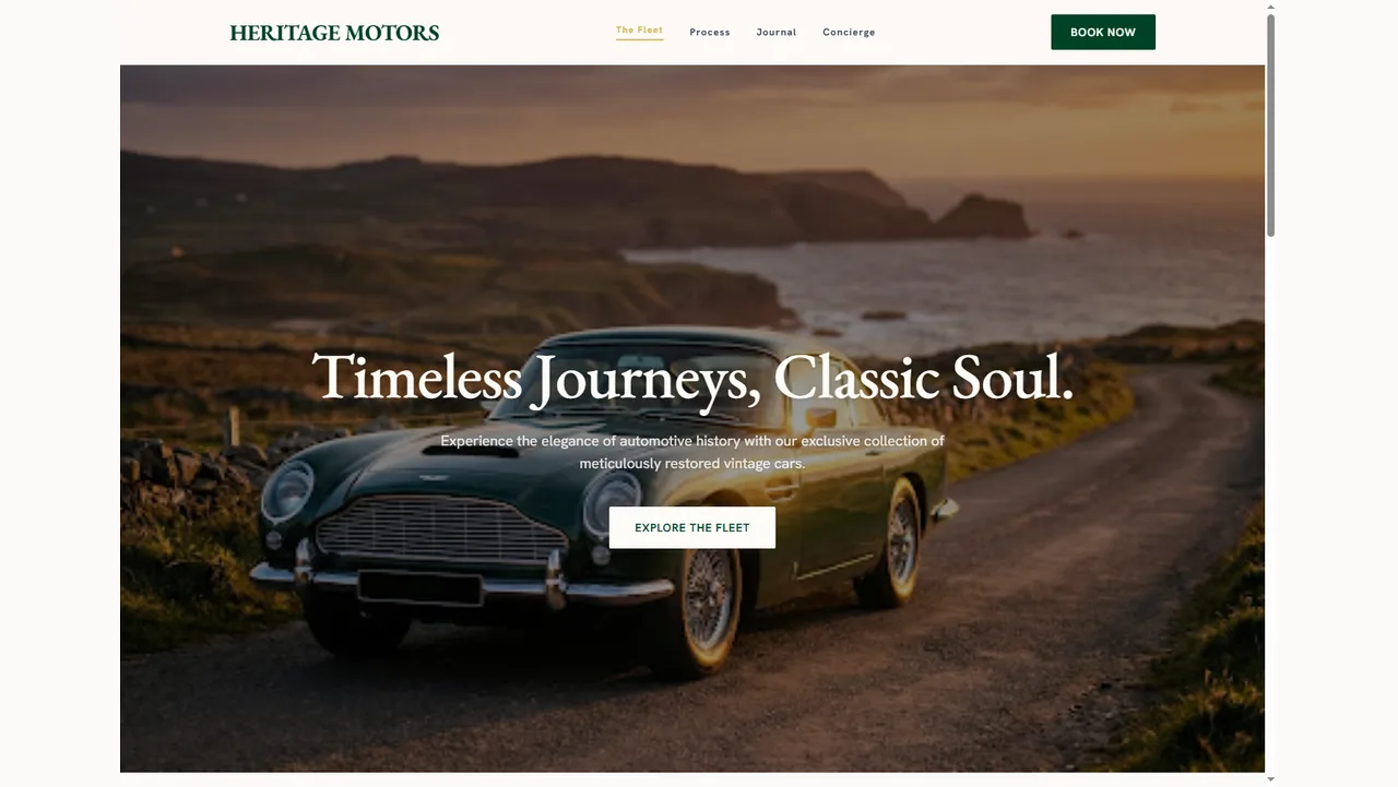
Heritage Motors — Classic Car Rental

design a rental experience for vintage and classic cars that feels closer to a boutique travel brand than a standard car rental site.

Vintage cars sell on romance, not specs. So the entire visual system leans into that: a warm, editorial serif for every headline, a muted palette of cream, deep forest green, and sun-worn browns, and a hero image of a Jaguar convertible on a coastal road at golden hour instead of a studio product shot. The tagline, "Timeless Journeys, Classic Soul," sets the tone before a single feature gets mentioned.
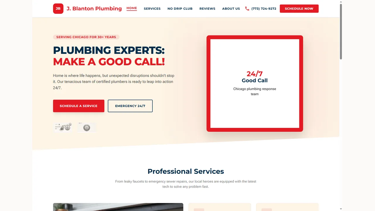
J. Blanton Plumbing — Local Service Business
J. Blanton Plumbing — Local Service Business preview generated from source code
02 / Website design and conversion-focused UI

J. Blanton Plumbing — Local Service Business

design a local trade services site that builds trust fast and makes booking an emergency call effortless, without falling into generic "contractor template" territory.

Local service businesses live or die on speed of contact, so this design front-loads two very different CTAs right in the hero: "Schedule a Service" for planned work, and a hard-to-miss "Emergency 24/7" for anyone in an actual crisis. A custom illustrated mascot (a plumber holding a wrench) replaces the generic stock photography most trade sites lean on, giving the brand a bit more personality without losing credibility.

Hearth & Crust — Pizzeria
Hearth & Crust — Pizzeria preview generated from source code
03 / Website design and food and beverage UI

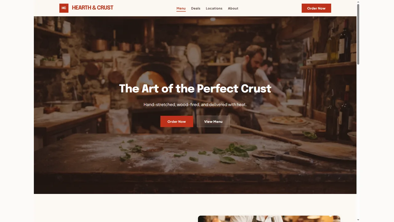
Hearth & Crust — Pizzeria

design a pizzeria site that sells craft and process, not just a menu, aimed at a wood-fired, artisanal positioning rather than quick-service.

Food businesses sell with imagery first, so this design opens with a full-bleed photo of dough being hand-stretched mid-motion, immediately signaling craft over convenience. The headline, "The Art of the Perfect Crust," and subhead about wood-fired delivery reinforce that positioning before the menu ever appears. Warm terracotta, deep charcoal, and cream keep the palette appetite-friendly without falling into the red-and-yellow fast-food cliché.

AvianPro — Birding Optics Ecommerce
AvianPro — Birding Optics Ecommerce preview generated from source code
04 / Mobile ecommerce design

AvianPro — Birding Optics Ecommerce

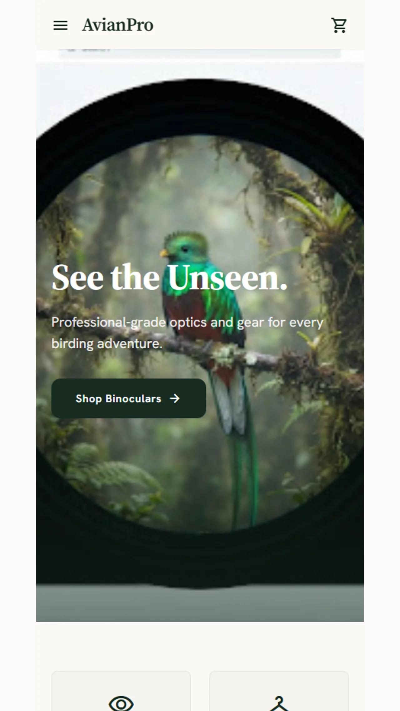
design a mobile-first store for a niche, enthusiast audience (serious birders) where the product needs to feel precise and professional-grade, not like a general outdoor gear shop.

The hero sets the tone immediately: a photo shot through the barrel of binoculars at a quetzal in dense jungle, with the line "See the Unseen." It's a visual metaphor for the product category itself rather than a straightforward product shot, and it signals this is a store for people who already care deeply about the hobby. A deep forest green and warm cream palette reinforces the outdoors-but-premium feel, avoiding both generic camping-gear orange and sterile tech-store white.

Serene — Home Decor Ecommerce
Serene — Home Decor Ecommerce preview generated from source code
05 / Mobile ecommerce and brand design

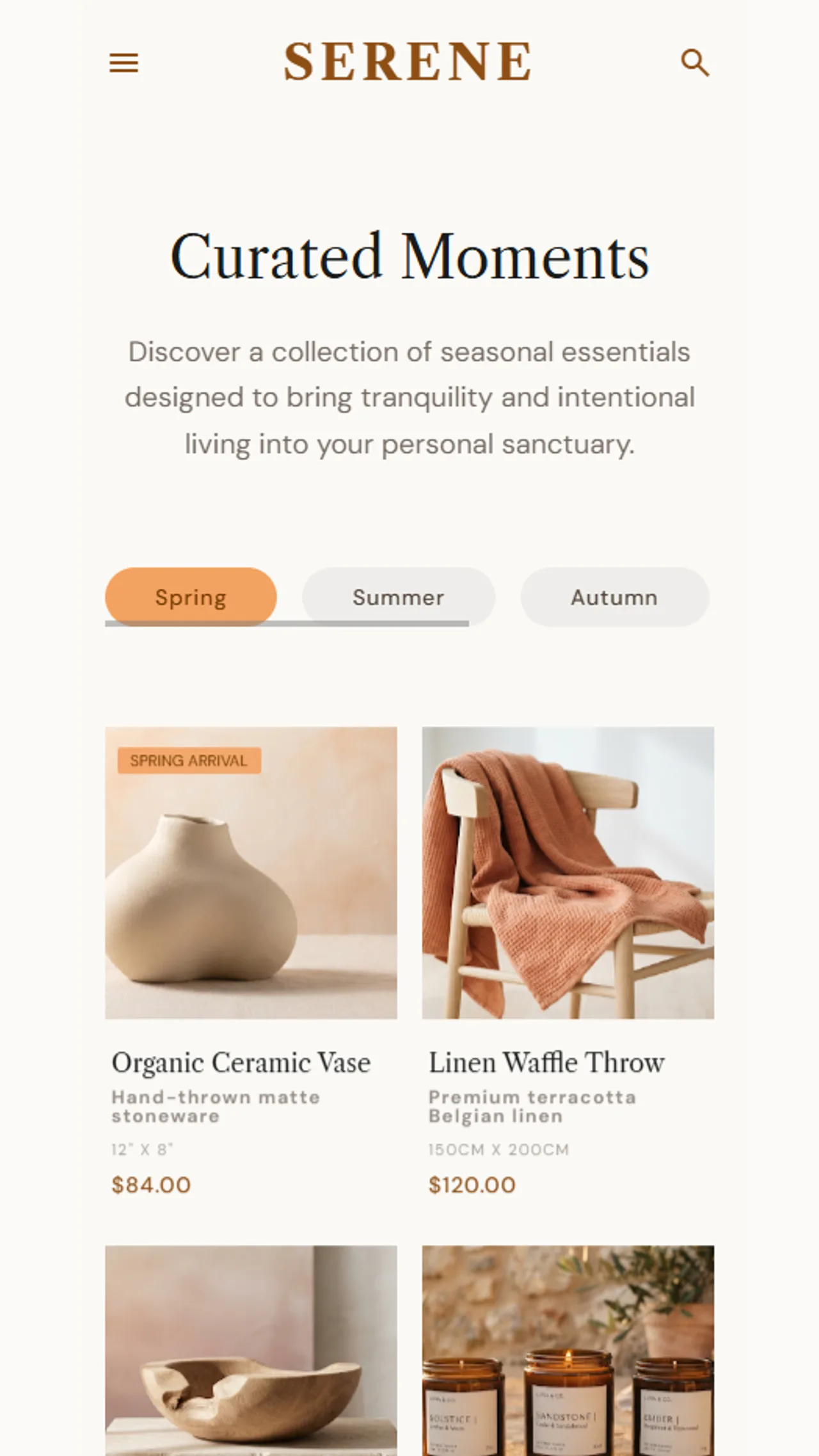
Serene — Home Decor Ecommerce

design a home decor storefront that feels closer to an art gallery or lifestyle editorial than a typical online shop, aimed at a customer buying a feeling of calm as much as a product.

Everything here is built around restraint. A large serif wordmark, generous white space, and a muted cream-and-terracotta palette do most of the brand work before a single product loads. The headline "Curated Moments" and its soft, editorial subhead read more like a magazine intro than a sales pitch, deliberately slowing the visitor down instead of rushing them toward a purchase.

Margalla & Beyond — Travel Discovery App
Margalla & Beyond — Travel Discovery App preview generated from source code
06 / Mobile app design

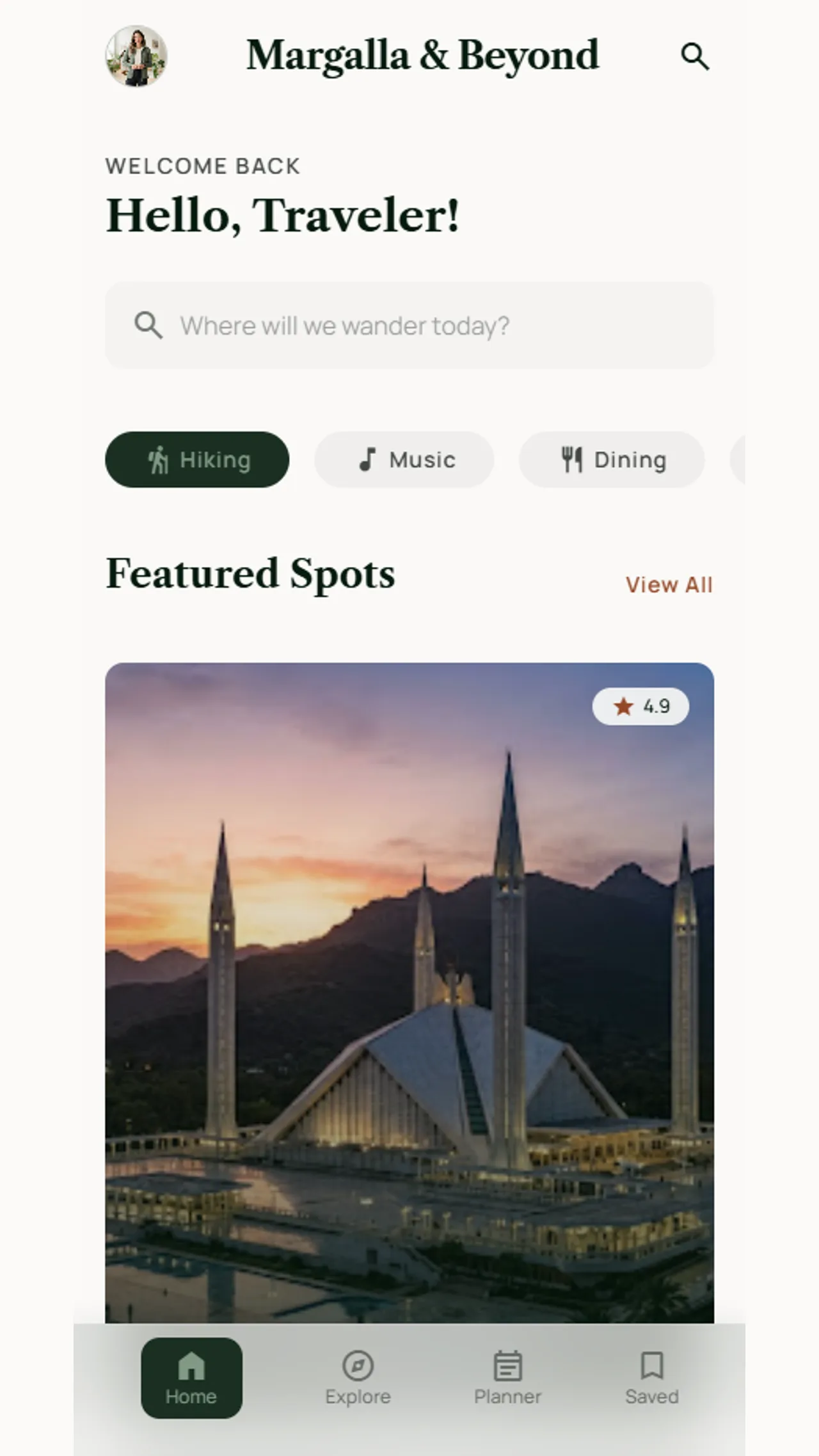
Margalla & Beyond — Travel Discovery App

design a travel and local discovery app centered on a specific region (Islamabad and the Margalla Hills), built around real, findable places rather than generic stock travel imagery.

The app opens with a personalized greeting ("Hello, Traveler!") and a conversational search prompt ("Where will we wander today?"), setting a friendly, exploratory tone from the first screen rather than a rigid search form. Category pills (Hiking, Music, Dining) let a user quickly narrow down what kind of experience they're after, mixing outdoor activity with cultural and culinary discovery in one place instead of separating them into different apps or sections.

Closing frame

Every brand needs its own visual language, not a template with new colors.

None of the six projects above share a layout, a color system, or a typographic choice, and that's deliberate. A vintage car rental and a plumbing company are solving completely different trust problems, so copying one design system onto both would flatten what makes each business worth choosing. That's the standard we hold every project to, whatever industry it's in.

Bring us your business and we'll figure out what it actually needs to look like. Start a project.
Work questions

FAQs

Clear answers about what these showcases represent.

Are these real client projects?

These are design projects built by Octadevstudio to demonstrate range and design thinking across different industries, not commissioned client work with measurable outcomes to report.

Can you design something this specific for my industry, even if it's not shown here?

Yes. These six cover a deliberately wide spread (hospitality, local trade, food service, niche ecommerce, lifestyle ecommerce, and travel/mobile) specifically to show range rather than a narrow specialty.

Do you build these designs into working websites and apps too, or just design them?

Both. Design and development happen under one team, so a project like these moves from concept straight into a working, responsive build. See web development and mobile app development for what that involves.

Which service would a project like Serene or AvianPro fall under?

Primarily UI/UX design for the visual system, paired with web development or mobile app development depending on the platform.